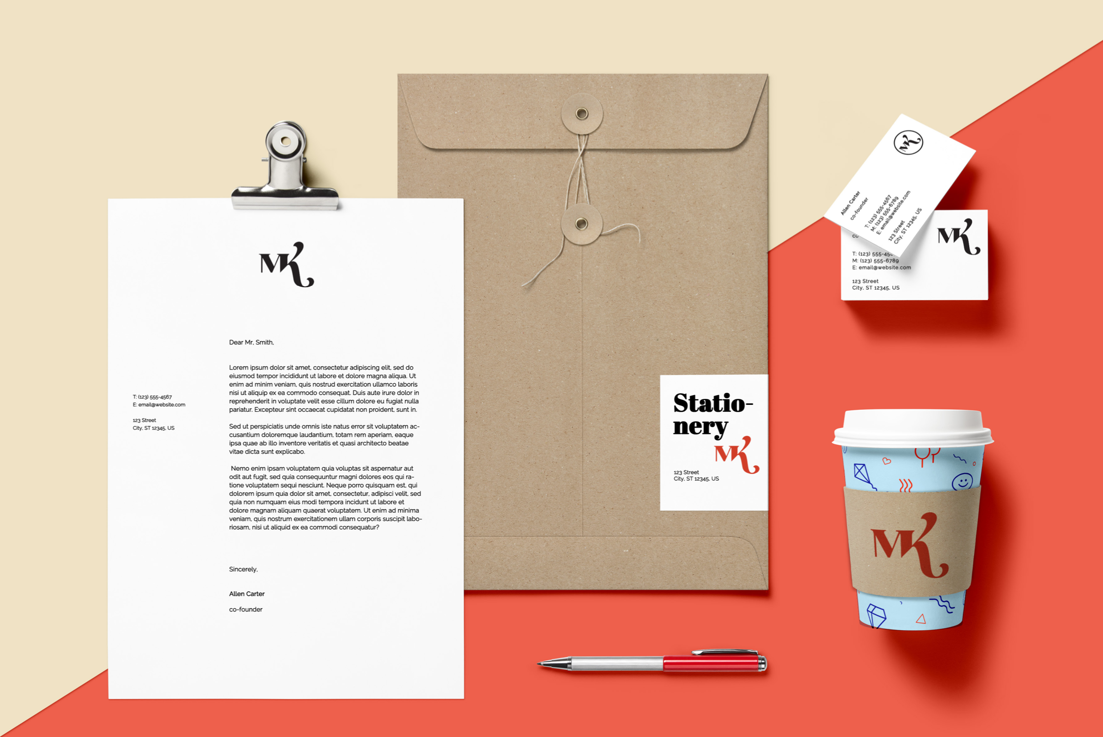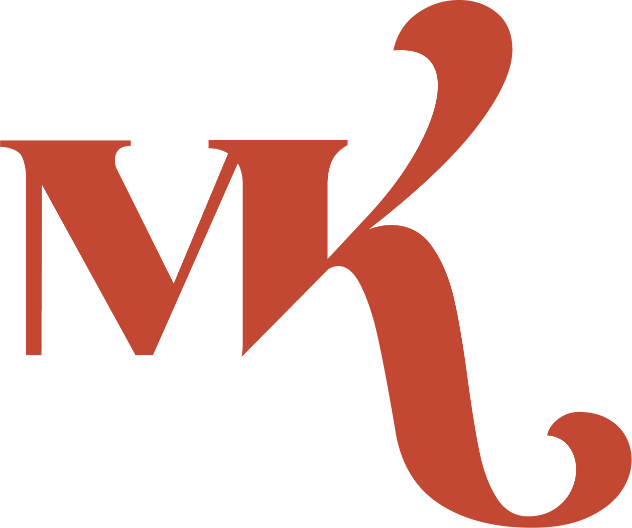
01 Logotype
Brief
Brief: Design a logotype with your 2 (or 3) initials. Start with hand-drawn typo sketches as well as using existing typefaces and hand- trace possible designs using those typefaces as template.
This project introduces logos/logotypes with the aim to develop an understanding of typographic forms further. The ability to experiment with the compositional principles of continuity, alignment, proximity, figure and ground as well as similarity and contrast are a focus of this brief.
Logo development process
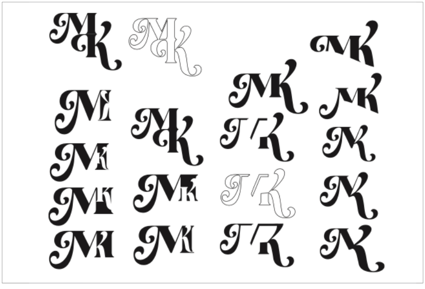
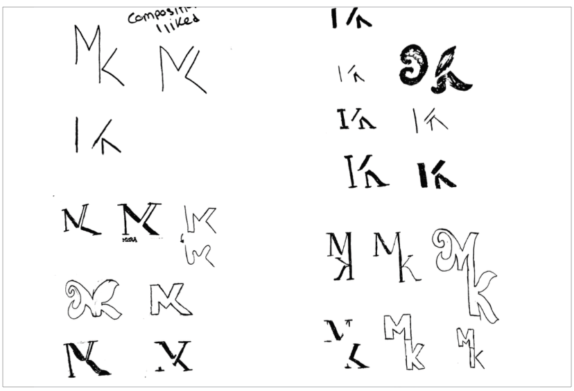
I chose my first and last initials and experemineted with those. Using 2 letters created a simple clean logo.
Rationale
After experimenting with
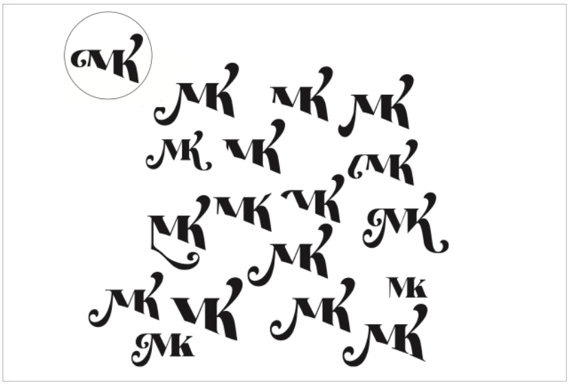
hand-drawn sketches, I found a font that matched my drawings really well. I chose the font Kaoly and experimented with the compositions.
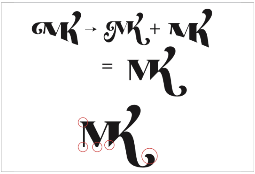
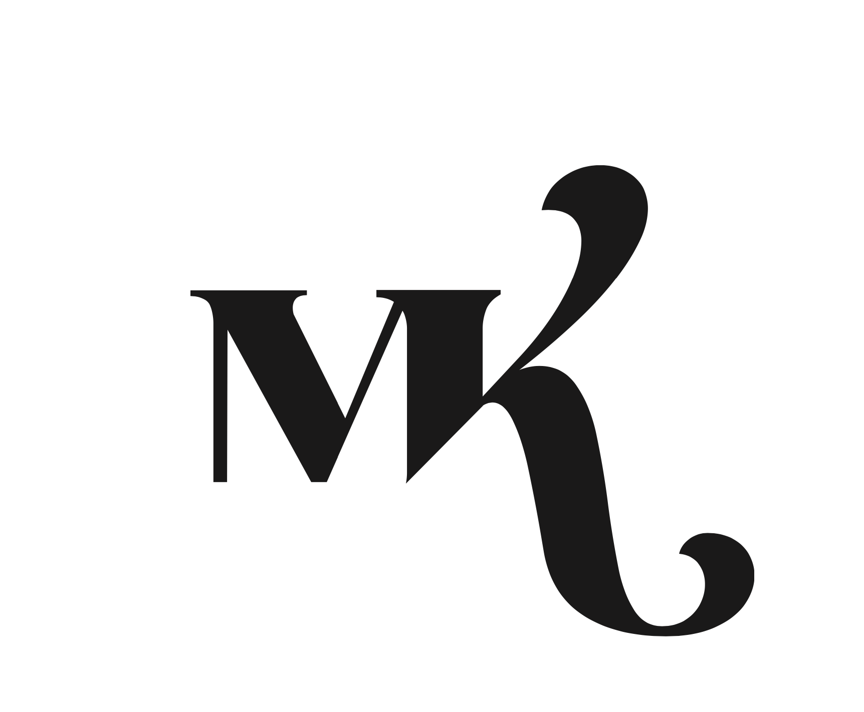
I recreated some previous sketches and created new compositions, with tiny differences. I chose a composition I really liked and further refined it, which led to my final logo.
The simplicity of a logo is very import, as the letters need to be easily recognisable, and the logo needs to be easy on the eyes to be memorable.