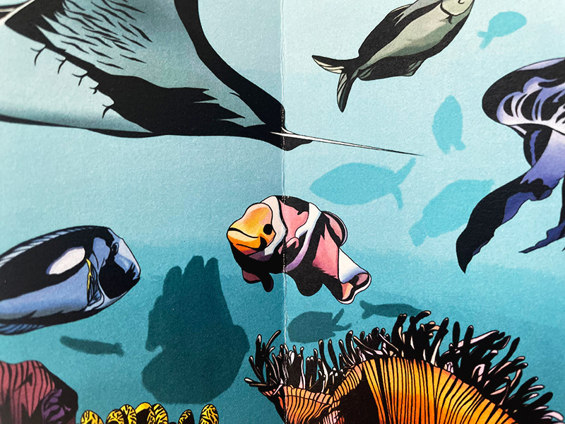
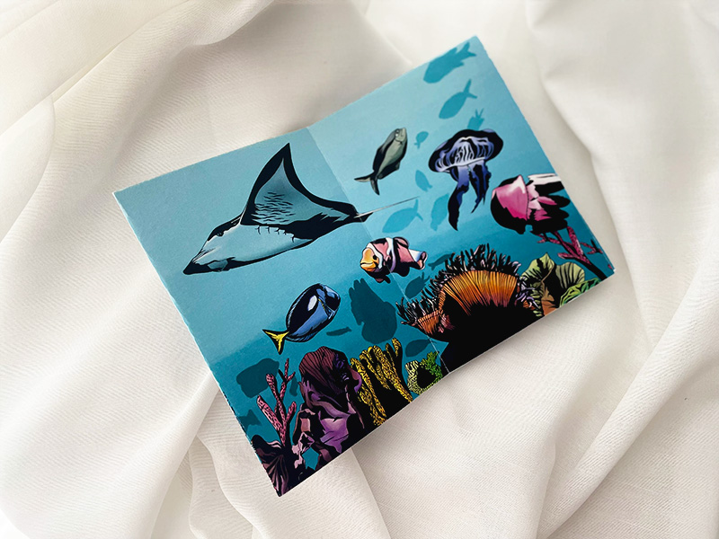
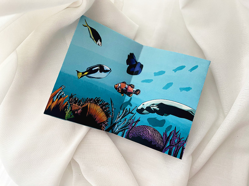
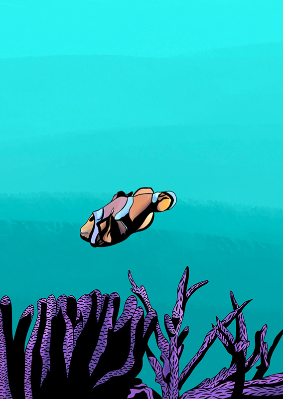
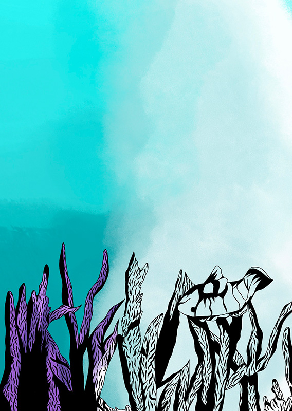
This project was an extension of my zine and poster about coral bleaching from last semester. This involved modifying the illustrations for the zine and poster.
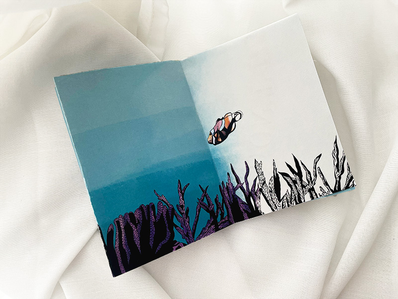
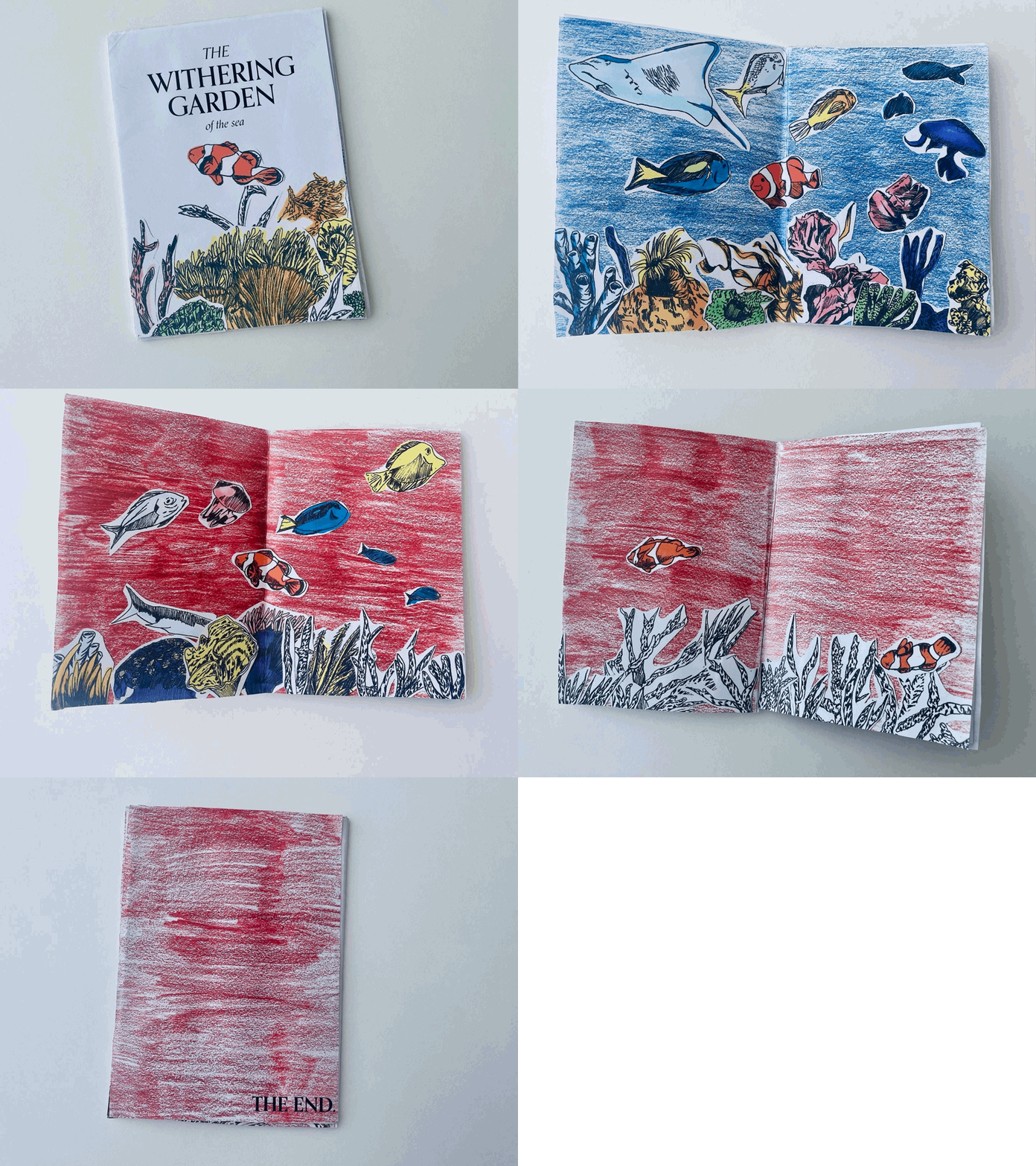
Extending my zine from last semester, I decided to tell a story of the literal (rather than metaphorical) process of coral bleaching from the perspective of a clownfish. Through digital illustrations and the fading of colour, I wanted to explore the idea of "fading away" to demonstrate that sea creatures and coral have an interdependent relationship when "fading away" towards death. Thus, raising awareness of the consequences of coral bleaching. For my poster, I decided to add animated elements. This included making the fish move, text fading in and out, and mapping coral bleaching throughout the years. Furthermore, making the poster engaging in a short Youtube video.
FINAL OUTCOME
PROCESS
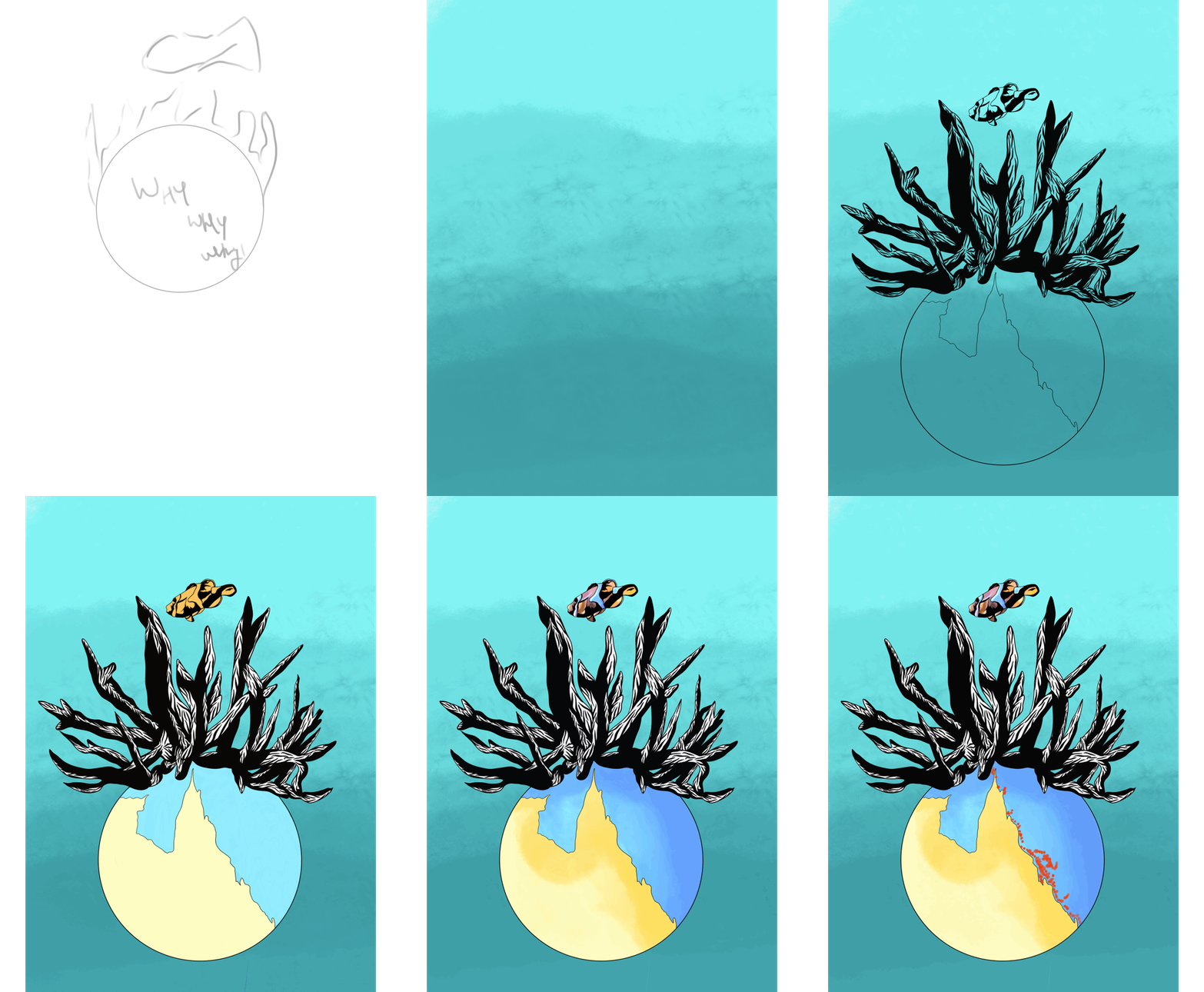
Process of illustrating zine
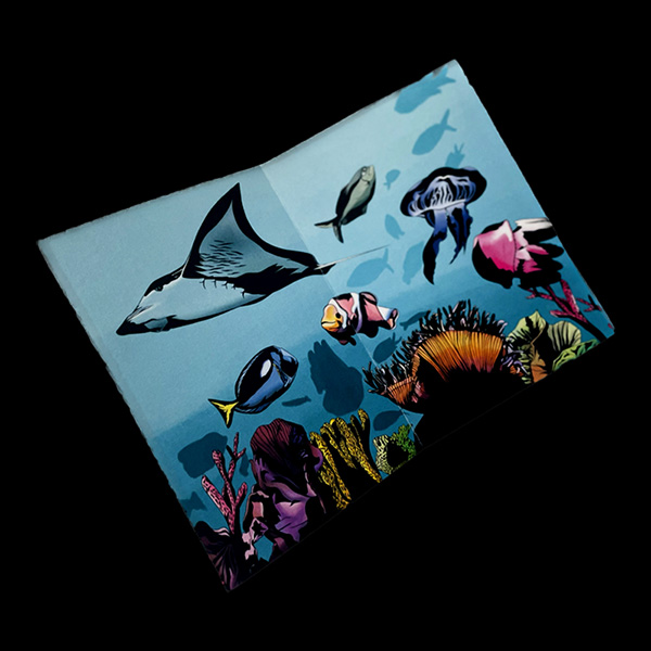
This involved me sketching, lining, colouring, and shading my illustrations of the zine to explore a clownfish's experience with coral bleaching.
Initial pages 6 and 7
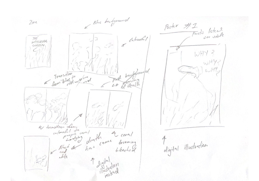
Initially, I was going to use single pages of the transition of the coral going from purple to white instead of a double-page spread. After receiving feedback from my peers, I changed it to a two-page spread, easily displaying this transition as presented above in the outcome.
Thumbnail sketches
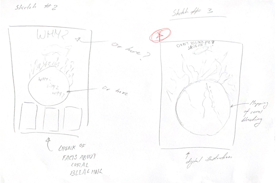
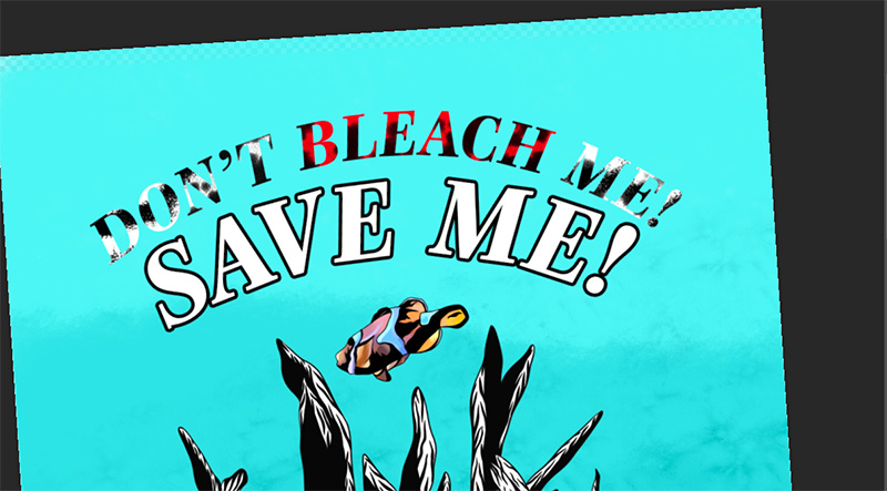
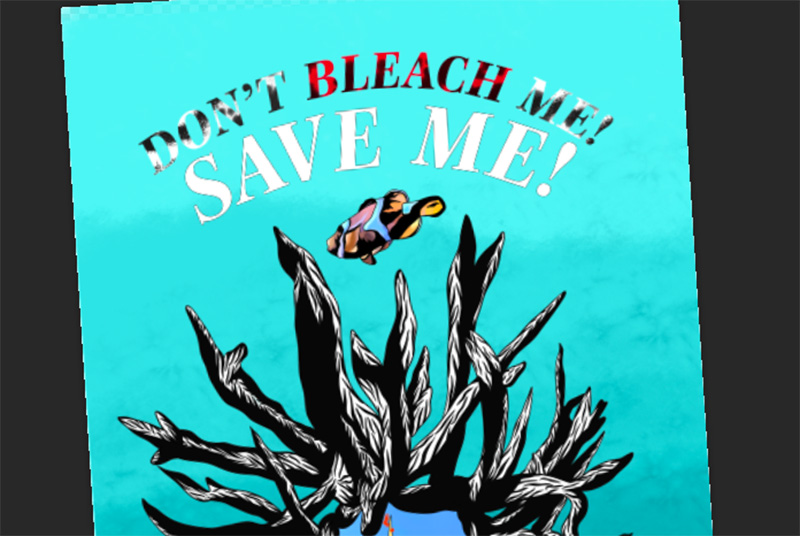
Process of poster
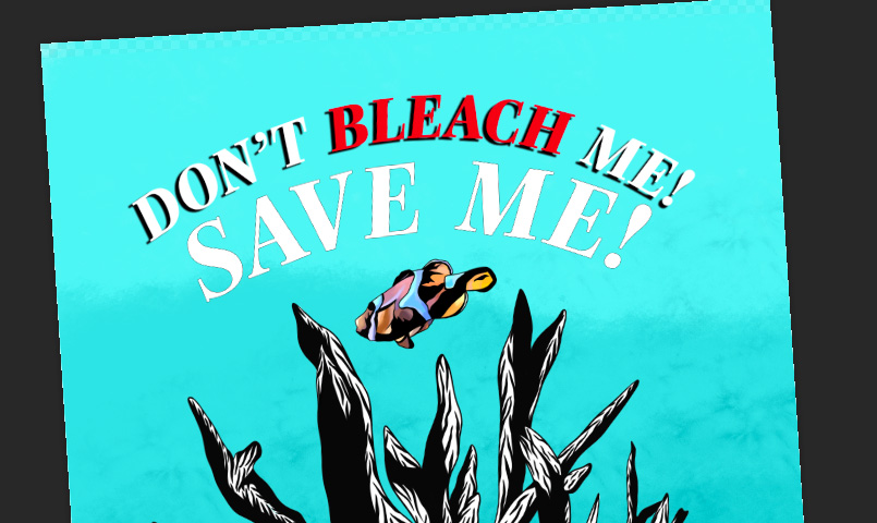
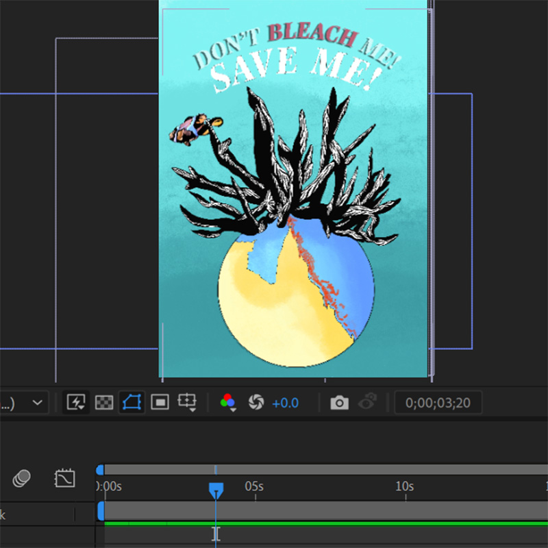
I felt the thinner stroke weight around "SAVE ME" was quite effective as, the thicker stroke was too bold. The drop shadow was effective because it added depth to the text.
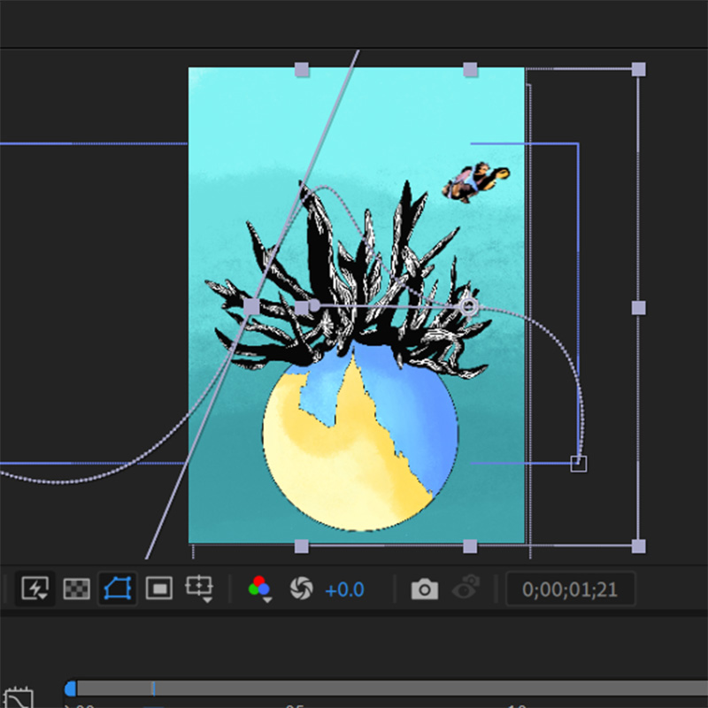
Process of animating poster
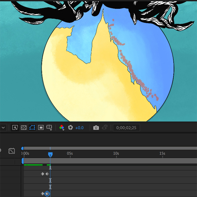
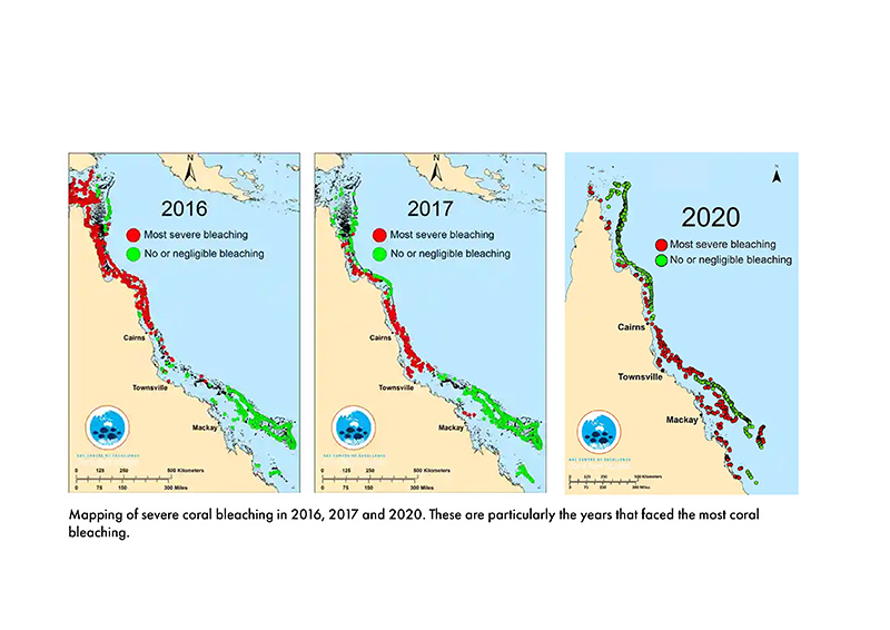
I experimented with paths allowing the clownfish to move across the canvas slowly. I also played with mapping coral bleaching, mainly presenting the transition from 2016 to 2020. These are the years that suffered severe coral bleaching. To do this, I repeatedly changed the text's opacity and the mapping from 100% to 50%.
Process of reworking poster
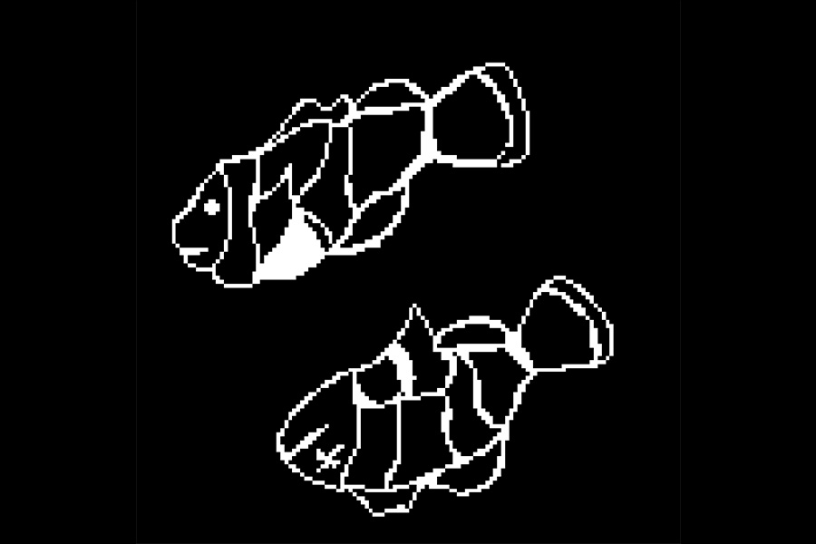
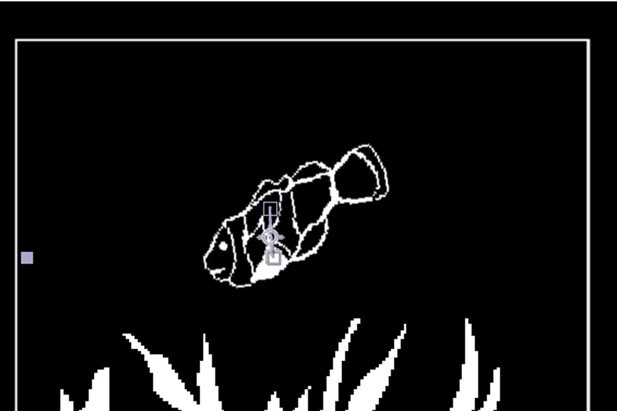
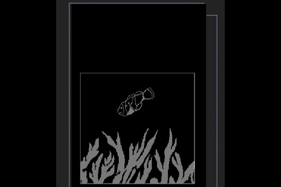
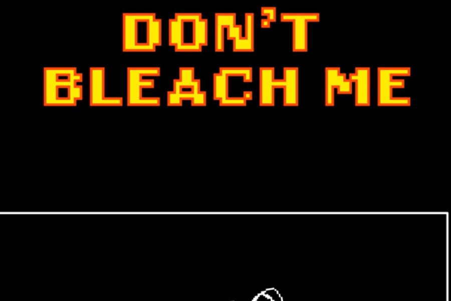
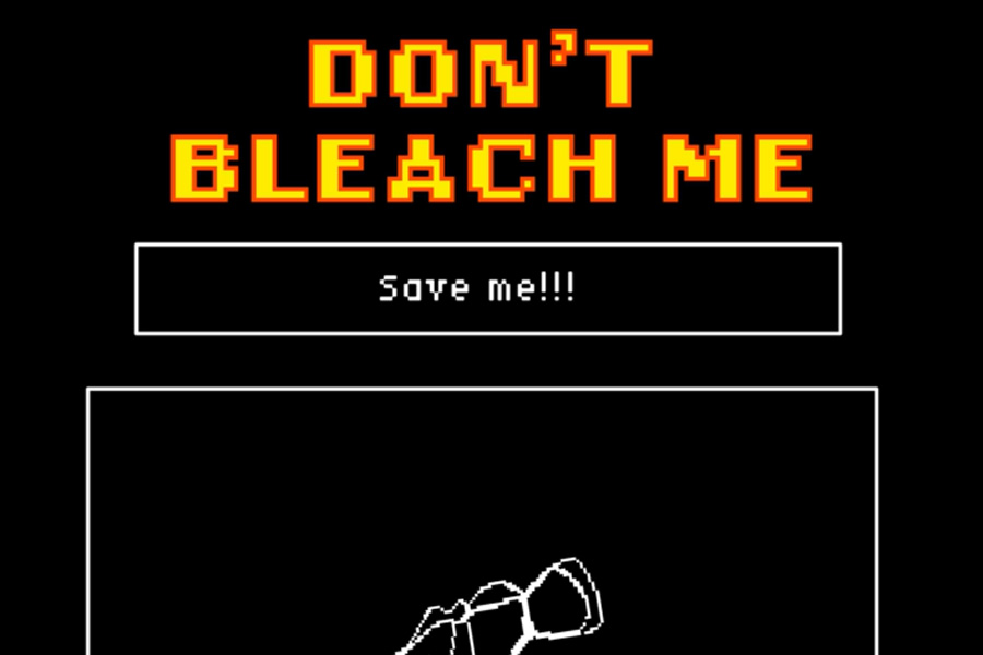
I decided to rework my poster design as I felt it was too "colourful" for coral bleaching. Regarding the coral illustrations, I chose the second illustration as it was simpler and was close to the notion of coral bleaching. Whereas, the first illustration was too detailed. For the clownfish pixel art illustrations, I chose the alive fish to position the viewer to make their decisions to prevent further coral bleaching. When designing the poster, the idea was to create it similarly to pixel art video games. I bolded the text with a yellow and red outline so audiences immediately see the headline and be alerted about the coral bleaching issue
Reworking poster animation
I decided that the rectangle, coral, and fish would disappear and reappear simultaneously, making the fish move up and down, emulating characters in a video game. To make the animated poster enjoyable, I make a typewriter animation for the text ‘DON’T BLEACH ME.’ I applied the same disappear and reappear text for the “SAVE ME!” to keep the audience’s attention to raise awareness of coral bleaching.
EXPERIMENTATION
I experimented with pixel art for the first time as I initially wanted to raise awareness about coral bleaching through pixel art. However, I realised that the quality of the pixel art would not be of high resolution and that making pixel art is time-consuming and prolonged.
PREVIOUS ZINE FROM LAST SEMESTER
VISUAL RESEARCH
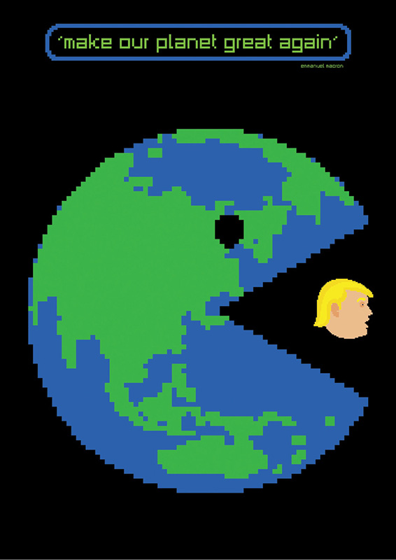
'Make our planet great again'
'Make our planet great again' by Mario Fuentes encapsulates pixel art of an Earth about to devour the head of Donald Trump. Inspired by the artistic style, I was initially going to compose my imagery with pixel art as it provided a feeling of a video game, an effective way to bring back nostalgia while raising awareness about climate change.
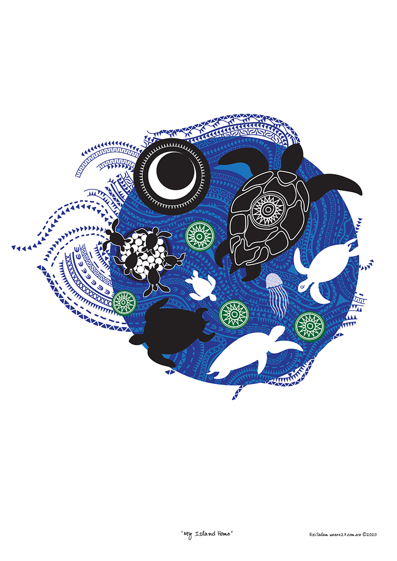
My Island Home
My Island Home by Riki Salam uses illustration to demonstrate that human activity, such as producing harm, can endanger the lives of turtles. Inspired by Salam's illustration of the journey of turtles growing up, I will include this idea of a journey through my story of a clownfish experiencing coral bleaching.
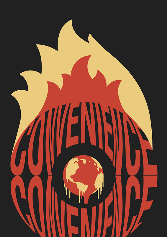
Convenience
Convenience by Zakkiyyah Shah depicts the word 'Convenience' surrounding a melting earth surrounded by fire to raise awareness about bushfires. I drew inspiration from the visual metaphor because it effectively communicates the climate issue, and I will do something like this to raise awareness about coral bleaching.
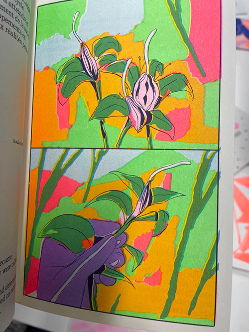
Insula (2020)
In his illustrations, Vincent Longhi uses vivid and bright colours to communicate this different world. Influenced by his use of colours, I will use saturated and bright colours in my zine to demonstrate that coral is colourful before experiencing coral bleaching.
Coral Bleaching Maps
Coral Bleaching Maps by Coral Reef Studies encapsulate the severe coral bleaching areas around Queensland, particularly the Great Barrier Reef, from 2016, 2017, and 2020. I chose to include this mapping of coral bleaching in my animated and still poster to convey that coral bleaching is a significant issue.
REFERENCES
Coral Reef Studies. (2022). Coral bleaching and the Great Barrier Reef [Map]. Coral Reef Studies. https://www.coralcoe.org.au/for-managers/coral-bleaching-and-the-great-barrier-reef
Fuentes, M. (n.d.). Make our planet great again [Poster]. Mate Act Now. https://mateactnow.com/mario-fuentes
Longhi, V. (2020). Insula volume 1 [Illustration]. Glacier Bay Books. https://glacierbaybooks.com/product/insula-volume-1/
Salam, R. (n.d.). My Island Home [Poster]. Mate Act Noew. https://www.mateactnow.com/riki-salam
Zakkiyya, S. (n.d.). Convenience [Mate Act Noew]. Poster. https://www.mateactnow.com/zakkiyya-shah
YOU MAY ALSO LIKE
JESSICA LIANG 2022
.jpg)
