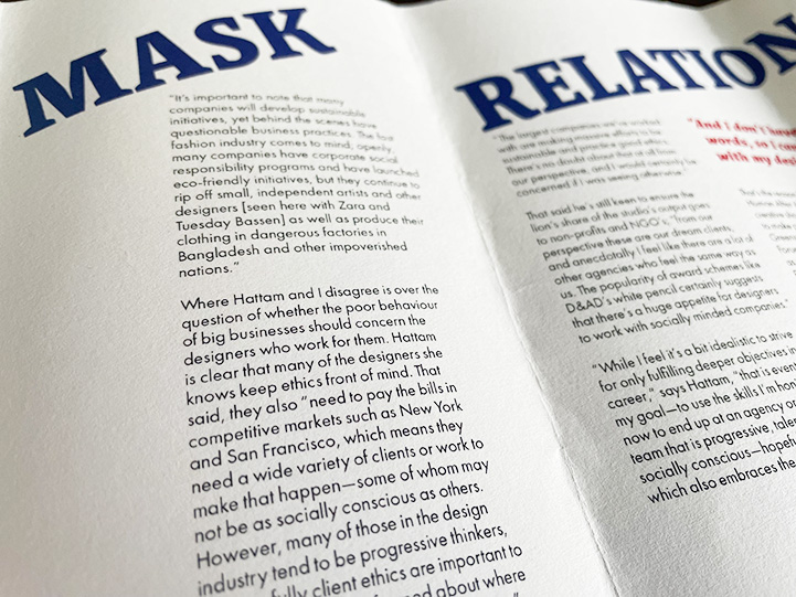
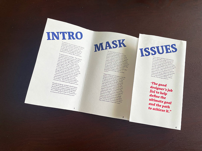
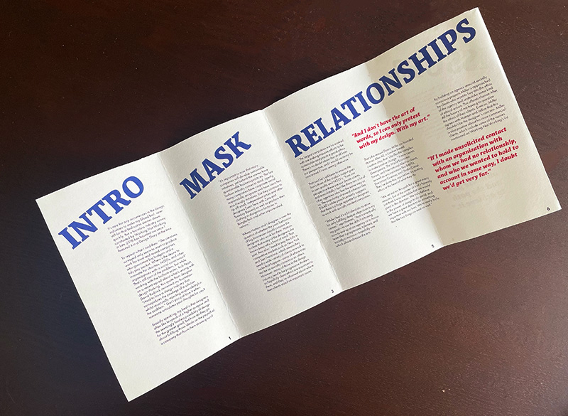
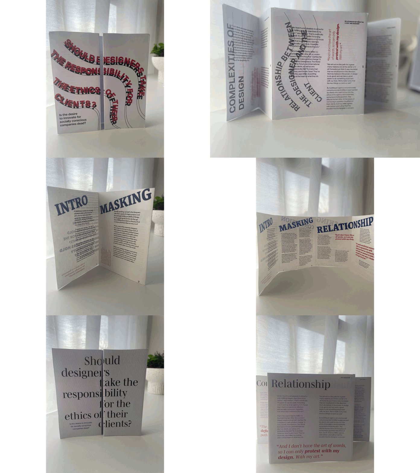
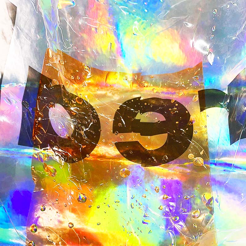
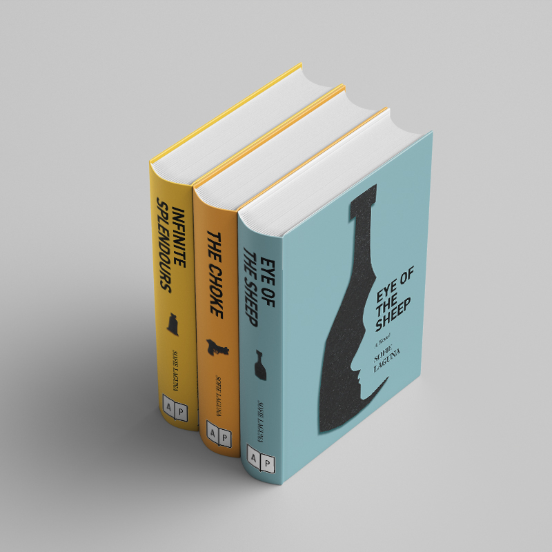
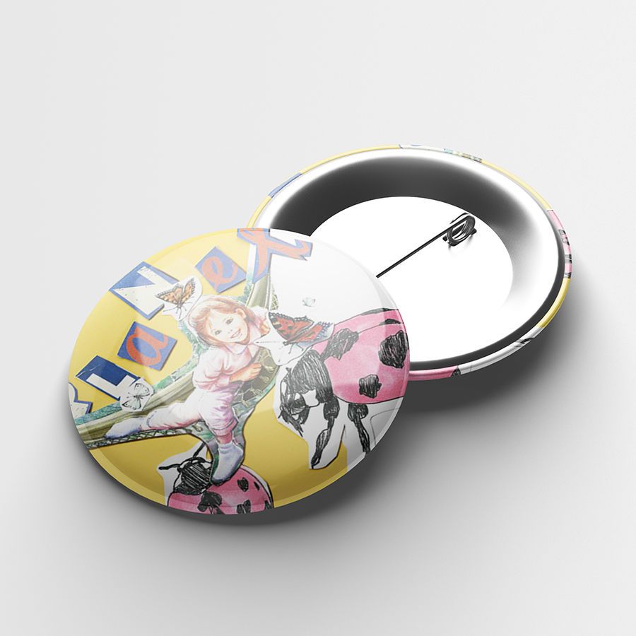
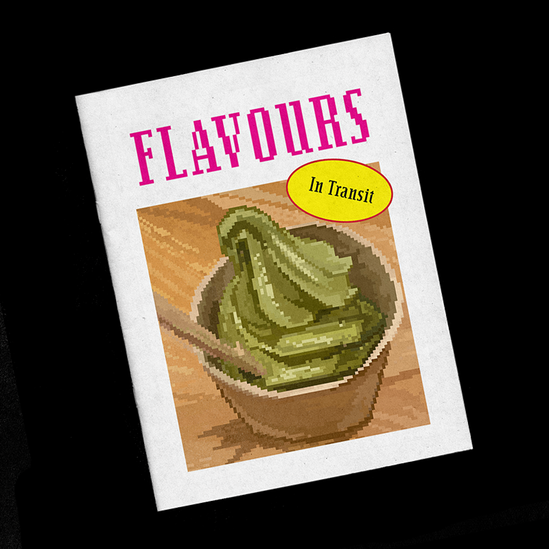
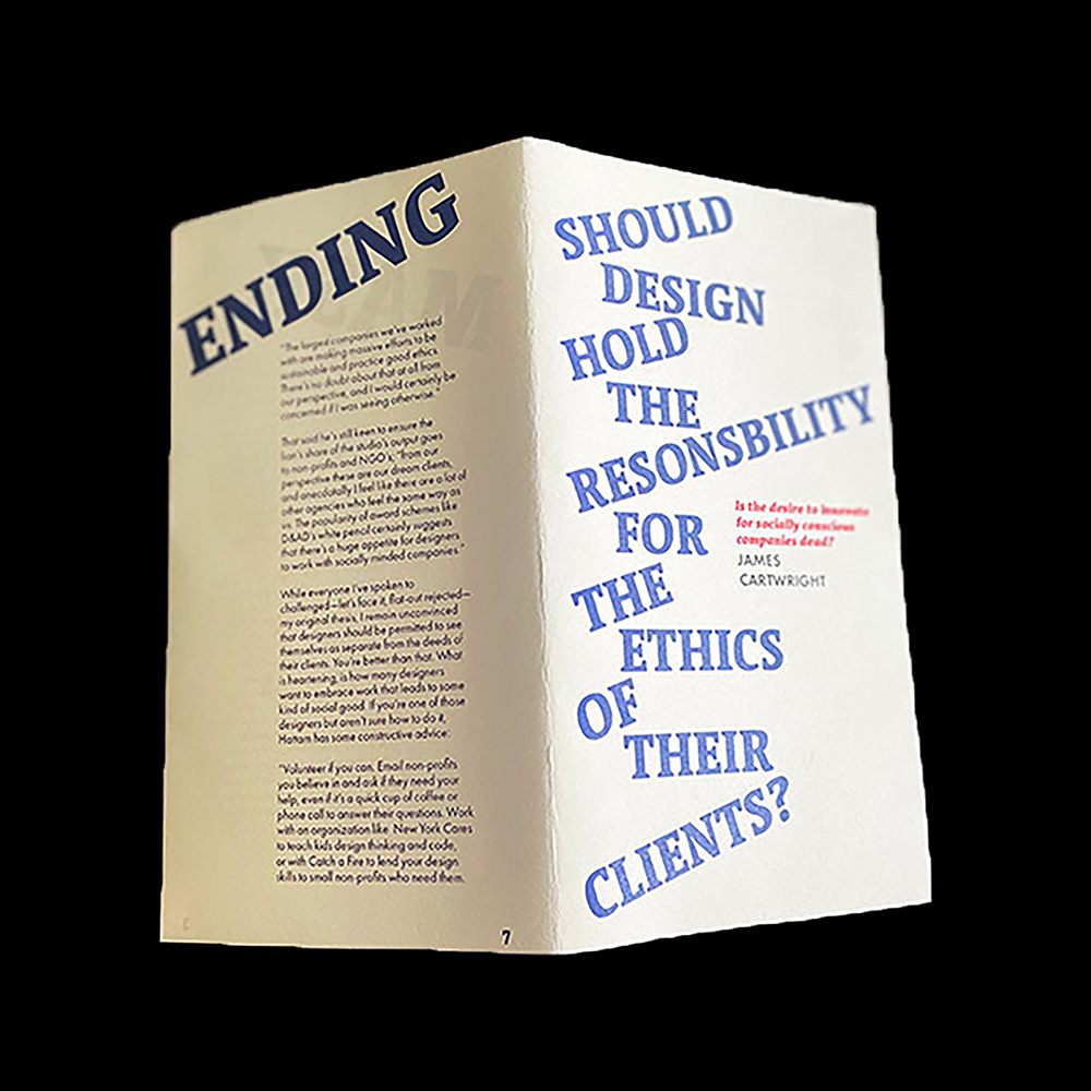
Project 07 involved creating a modified typographic layout on a fold for the article ' Should Designers take Responsibility for the Ethics of Their Clients?'by James Cartwright.
Drawing from the article’s idea of the interdependence between the client, design, and ethics, I sought to demonstrate the conflict and tension designers face with ethics and clients in my layout. Influenced by Livia Lima’s masterclass, I incorporated the tips for typographic design in my publication design to present a sense of harmony.
FINAL OUTCOME
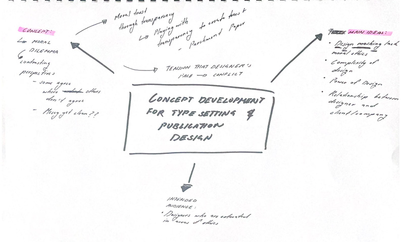
PROCESS
Concept development
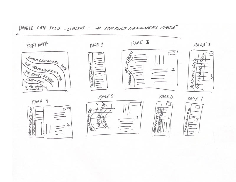
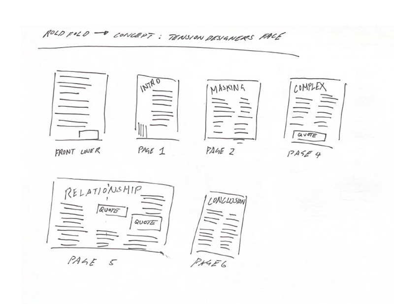
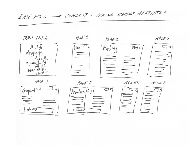
Thumbnail sketches of three iterations
These three iterations ranged from different typographic layouts, typefaces, paper materials, and folds.
VISUAL RESEARCH
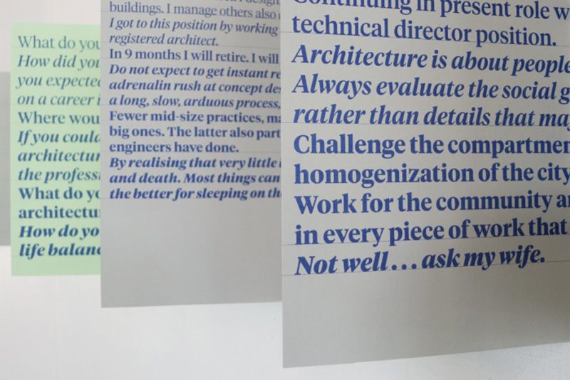
A Corporate World - Diverse Practice School of Architecture, VUW (2011)
A Corporate World - Diverse Practice School of Architecture, VUW (2011) by Catherine Griffiths portrays a clean typographic layout that restricts to 3 colors, inspiring me to include this in my design to create a hierarchy. I also drew inspiration from the accordion fold used to display the typography, as it allows the viewer to engage in the information quickly.
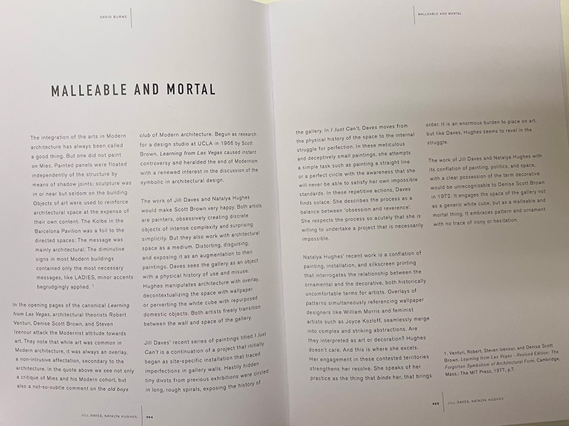
Malleable and Mortal (2013)
Malleable and Mortal (2013) curated by David Burns effectively uses hierarchy through the contrast of font weights of the header and body, influencing me to experiment with contrasting two typefaces and font weights to allow the viewer to recognise a sense of harmony throughout the typographic layout.
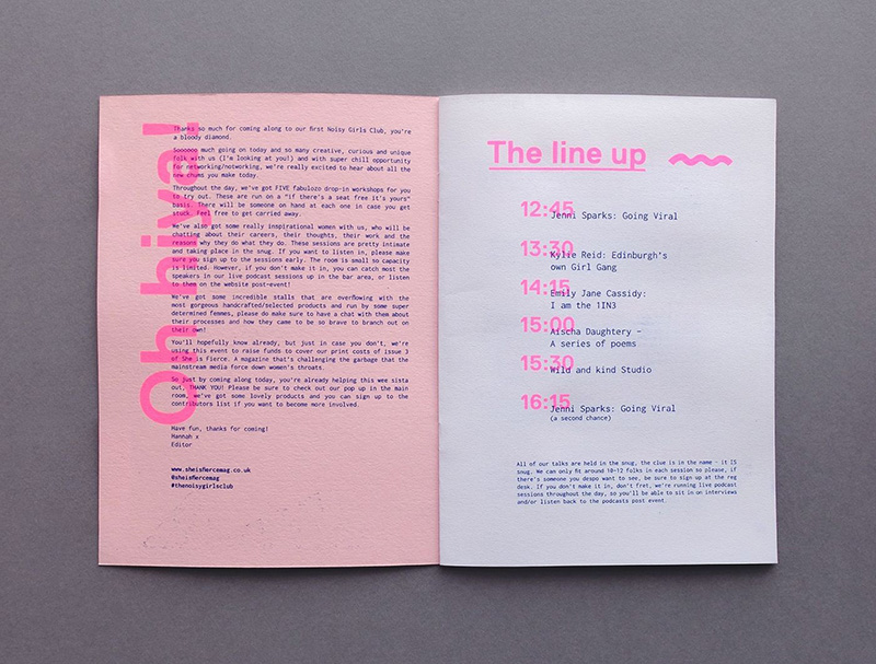
The Noisy Girls Club (2017)
The Noisy Girls Club (2017) by Liah Moss and Angela Kirkwood successfully play with transparency and overlapping text across the pages, leading me to experiment with overlapping text to reinforce the idea of playfulness. Furthermore, their effective use of left-aligned rags and block-like paragraphs creates harmony throughout the pages.
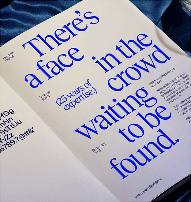
Dating Site Match Launches New Look (2021)
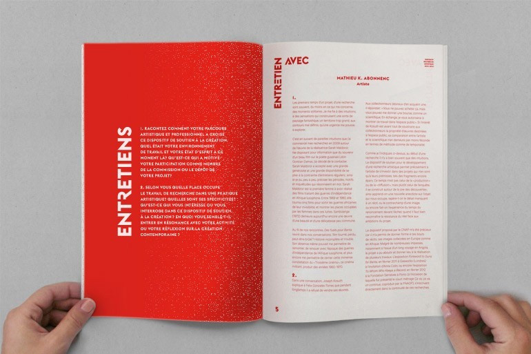
Dating Site Match Launches New Look (2021) by COLLINS cleanly arranges display type, contrasting the body copy size to create hierarchy, drawing viewers immediately to the large text scale. Influenced by this and white space, I will use two typefaces and text sizes to create contrast and hierarchy.
Women of Graphic Design (2014)
Women of Graphic Design (2014) by Caroline Fabes restricted to two colours which are simple and effective. Her restriction influenced me to two colours and hierarchy as it was clean and portrayed harmony throughout the publication design.
The mentor and the protege (2017)
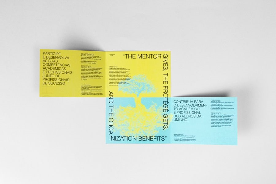
The mentor and the protege (2017 by UMinho uses a playful fold and typographic layout, inspiring me to make a fold like this as it invites readers to read the publication design easily.s
REFERENCES
Burns, D. (2013). Malleable and Mortal [Publication]. N. https://burns.art/malleable-and-mortal
COLLINS. (2021). Online Dating Site Match Launches New Look [Publication]. LOGO DESIGNER. https://www.logo-designer.co/online-dating-site-match-launches-new-look-by-collins/
Fabes, C. (2014). Women of Graphic Design [Publication]. Caroline Fabes. https://carolinefabes.com/
Griffiths, C. (2011). A Corporate World - Diverse Practice School of Architecture, VUW (2011) [Publication ]. studio catherine griffiths. https://www.catherinegriffiths.co.nz/05-exhibition-diverse-practice.html
Moss, L., and Kirkwood, A. (2017). The Noisy Girls Club [Publication ]. Behance. https://www.behance.net/gallery/57285249/The-Noisy-Girls-Club
UMinho. (2017). The mentor and the protege [Publication ]. Gen design studio. http://gendesignstudio.blogspot.com/2017/06/the-mentor-and-protege.html
YOU MAY ALSO LIKE
JESSICA LIANG 2022
.jpg)
